
Last time, I found they were installing solar lighting along the edges of paths in Strathclyde Park.
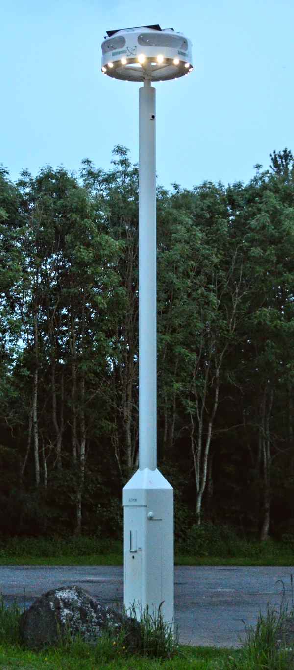
This time, an evening visit revealed some snazzy new LED (possibly solar-powered too) lighting units installed in the car park area.
It took a moment for these to register, then I realised I was looking at something new.
Very substantial columns holding an interesting circular array of LED light sources, and quite different from the more usual plain rectangular panels of LEDs used for most outdoor lighting installations, and street lights.
While it was already too dark for me to make out any of the details on these units, the one obvious feature was angled arrays of solar panels on top of the lighting head.
It’s nice to see someone actually THINK about their design, and how the LEDs are angled to light the surrounding area. So many installations appear to be designed by people who don’t have a clue, and mount the light sources pointing straight down, or straight out from the side, as if it was only possible to fit the sources only vertically or horizontally.
My neighbours suffer from the same ‘blindness’, and have mounted floodlights supposedly t light their back garden, but have just mounted them flat against the house wall – so they just shine straight into my rooms! Would it really tax their brains so much just to angle the fittings down, to shine INTO their garden rather than OVER?
Although I zoomed into the circular head unit with its ring of lights only a few seconds later, the resulting shot was a completely different thanks to the evening light.
There’s no detail, and the colour went crazy.
I couldn’t correct it using any processing filters, and any manual attempts caused the white light sources to change to whatever colour of correction or rebalancing I applied.
Looking at the histogram showed three distinct, narrow, red, green, and blue peaks, with almost no overlap or distribution
Changing the RGB levels didn’t do anything useful. The white lights became coloured lights, but I could not, for example, make the white central column look white, or make the sky look as it does in the pic above.
What I did find was that adjusting the contrast and gamma DID change the overall colour balance of the image, which was very odd.
Unfortunately, making these changes did not have the desired result, which was to improve the visibility of the name seen on the ring. That barely changed.
I took more than one of these shots – all showed the same effect, so it wasn’t simply one bad shot. Something was upsetting the metering and capture.
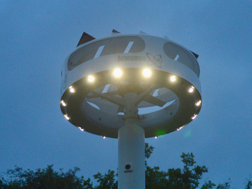
The name shown is ‘AUTONOMOUS’, with a graphic or logo to its right.
At the time of this post, I couldn’t track down any info on this item.
Clearly, I’ll have to try to remember to repeat that last shot during a daytime visit to the park, when there’s some ‘normal’ light bouncing around the place. Or maybe try flash?
It’s just weird how the large view came out as expected given the evening low light, but the close-up just went nuts under the same light.
