I had to stitch a view of the facade of Ayr’s bus station in Sandgate, because it’s a narrow street and the facade is wide. You simply can’t take a few steps back to get it all into one shot.
This was the result.
While the geometry may have been satisfied, I wasn’t really happy.
I think the view is fine, but having the unavoidable cars in view means the distortions made to create the pic are made more obvious than they need to be.
I still had all the source views, so decided to give them another stitch, but avoiding the correction to horizontal and vertical this time (well, the horizontal at least).
I wouldn’t say it’s better, but it does retain the original perspective of looking up and down the street (or left to right if you prefer).
Either way, both results bother me.
Next time, I might try a series of planar shots as I walk along the facade – the only problem with this method is that while I can often stitch such views (most free software protests, being based on a stationary camera being rotated on a tripod for its calculations), it often fails as the perspective of items close to the camera (such as cars and lampposts) appear to change their position against the background, so the software can’t find and match them.
In this case, the narrow street means I can’t just stand a little further back to avoid this issue.
Can NOTHING just be simple?
Anyway, this is the revised stitch for this view at least.
I’d no idea I was standing so far from the centre!
I wonder if something there stopped me from getting the spot?
A little something that doesn’t seem to have any mention on the popular ‘Glasgow Mural Trail’ guides I’ve found, or features in any image searches I’ve tried for murals in the same area.
In fact, if you only walk along Eglinton Street, you’re guaranteed never to see it, since it’s well hidden behind a 4-metre wall with no handy places to climb, or stand, for a look over its top.
The only way to see it is to arrive, or depart, on a train, also arriving or departing Glasgow’s Central Station.
I tried adding Central Station to the search string, but that failed miserably as the station has gained its own murals recently, and that’s all the search kept finding.
However, if you know what you’re looking for, and where/when to look, then the upper deck of one of Glasgow’s double-decker buses which travels along Eglinton Street will do the job too.
But don’t try this in winter, when the cold, damp weather will probably render any view from those windows non-existent, as they’re likely to be covered with condensation.
I’d given up trying to see this since the end of last year’summer, such was the constant appearance of steamed up windows, and only collected the following pics when the bus made an extended stop across from this apparently unknown and long mural.
Best effort
Unfortunately, the view is extensively blocked by the gantries and overhead cables used to supply electricity to the trains.
The mural is far too long to catch in a single pic, meaning I had to take a number of pics, zooming into each shot as I panned along its length.
I had no real choice over the shots taken, and just hoped the image stitching software would not be too upset, and be able to find edge matches and stitch some of them together.
I also grabbed a few more from the moving bus as it left the stop – these turned out to be some of the most useful, delivering views almost completed blocked by the gantries while the bus was stationary at the stop.
Surprise Result
While the individual shots weren’t much to look at, stitched together in pairs they looked a lot better.
The biggest surprise came when I offered the lot to the stitching software – and it didn’t reject them with the soul-destroying ‘No Match Found’ response.
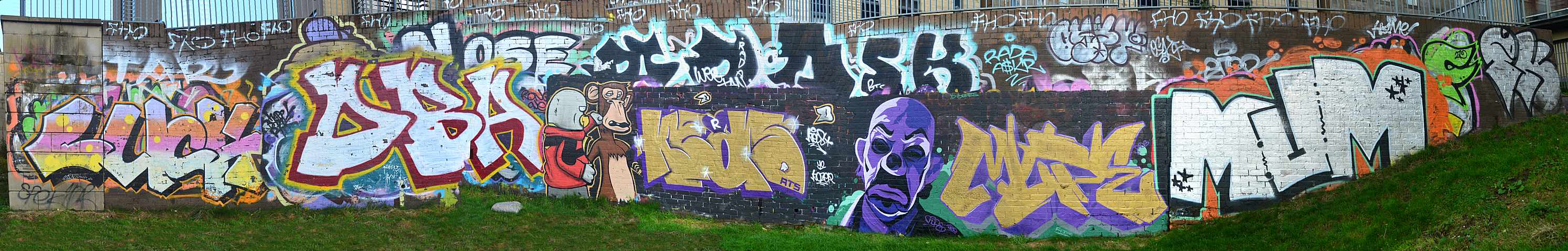
This is the longest view, which is complete from the left to the right – but I had to chop off the right-hand extent as the dreaded ‘Word Graffiti‘ morons have started to deface the area with their rubbish.
These are WIDE views which the blog’s fixed image format does not expand (they will ‘Click to expand’, but that still stays within the screen width), so you will need to use your own preferred method or tool to pan these images.
This is the second view, which shows the right-hand side detail that was obscured by gantries and wires in the first.
Is there any info about this mural?
As noted in the opening, I was unable to dig up any info or details regarding this mural.
If anyone knows better, please take a moment to add a comment below – it seems a shame that this goes unnoticed (except to rail travellers, if they happen to look up from their mobile phones and out of the window), and will probably succumb to vandalism by the Zero Respect Word Graffiti morons now dominating this area, and be ruined/lost,
Seems some maintenance was being carried out, and (I guess) the sluice valves had been opened to reduce the level.
Although I collected the general views without issue, when I went back to take pics of the revealed bottoms of the overspills and spillways. Normally well covered by water leaving the loch, I had found the lower water level meant these routes were almost completely drained, revealing normally hidden views.
That plan came to an end when I almost killed myself after stepping on some silt on a slope at the loch, and was lucky not to crack the back of my head on the concrete as my feet slipped from beneath me. However, this friction-free fall onto my back was sufficiently violent to send me crawling for home immediately, and unable to continue.
When I got back, although the level was still low, the sluices had been closed and the level was rising, so I’d missed my chance, and just had to make do.
As there’s no real choice of where the fairly wide pics can be taken, I had to try stitching to get the whole view in one pic, with between 12 and 17 shots being needed to never the area.
This was the most interesting view, at the NW end of the loch.
When first seen, there was almost no water falling from the loch, with all the water rushing from a square opening at the bottom corner of the wall on the left. The door can barely be seen now, but can be seen (a dark square) if you look carefully, just above the water’s edge.
I wondered how this door was opened and closed against the pressure of the water, and found there was a valve control behind that was, as seen below, presumably operated by a hand crank.
The dragon’s teeth, or dissipaters, were also fairly dry at the first visit, but were now also beginning to see an increase in the surrounding water.
Moving onto the similar feature at the SE end of the loch, the story was much the same, and I’d also lost the chance of catching these with almost no water covering these features too.
Notably, there doesn’t seem to be any sort of sluice valve or similar bypass at this end, at least I couldn’t see anything, or any sign of another door or valve control.
I forgot about another two outlets provided between these large overspills.
I’m not sure what facilities they have, but seem to recall some metal trapdoors or manhole covers, and these may lead to additional outlets, although they are locked so it’s not possible to see anything.
Related dragon’s teeth.
I had originally planned to reshoot the overspill shots once I’d seen the result, but that obviously wasn’t possible.
As yet, I’m still not sure how to frame these multiple shots when they require wide shots that introduce hefty edge distortion.
The software often seems to be able to cope IF I take the right contributing images, but if I miss out area around the edge, or the wide angle shots have distortion where images try to stitch, then things don’t go well.
This can be seen in some areas above, where the black means I missed a bit, and some crazy (wrong) edge stitching has been creating.
After playing with the images collected at Old Kilpatrick, of the River Clyde and Erskine Bridge (look back a few posts, for the images of this area I messed around with the lighting levels), I had one left over. Mostly river, with the opposite shore and a bit of bridge, it was on the verge of being forgotten as it didn’t add anything to those earlier edits.
But, I realised there was a quite a lot of overlap in the images, although they had not been shot from the same point, or matched for exposure – either of which can be enough to make the stitching software reject them, as it can’t find matching overlaps or edges.
For the sake of a few minutes effort, I threw them all in, since I learnt the software will accept those it can use, and ignore any that won’t match. There’s even an option to have it generate bits that are missing, not caught in the original image(s).
Given the lack of matching areas (to my eyes at least), I was surprised to see it produce the source for the image below.
It’s not perfect, but the overall lighting is not terrible, and it takes a moment to spot the area that has a pattern matching fail. I could have edited the mismatch with a healing tool, but that would have been too much like effort. However, I did play with the lighting, which was quick, and worth the minimal effort.
This one’s worth zooming as it’s bigger than my usual content, since the lack of detail meant the file size was small.
Nothing special about the view, other than a reminder that it can be worth taking a chance, since some image is better than no image/
Apparently famous, then disbanded, then reformed, and now doing Summer Nights.
Madam Internet knows all, so if you’ve never heard of them, find more there, like me.
Weather inversion?
The first two days of summer Nights were damp. Better described as ‘Rain Magnets’, they were both cursed with rain as the event kicked off for the evening, Irritating, since the days had been nice and dry up to that point.
Cue day three, and the pattern was reversed!
I spent most of the day out and about. While it didn’t actually rain (enough to be recorded), there was constant rain in the air, enough to feel, and sometimes lie on the ground, but it never amounted to anything – just persisted.
But, the evening was bone dry, not a drop – wish the previous days had been like that.
I’d thrown an extra t-shirt on, given how wet and chilly it had been before – I had to stop and take it off after cycling less than 2 miles towards Kelvingrove, it was just too warm.
Quiet Kassidy
I don’t know if few people are aware of Kassidy, but the place was deserted. The street is usually full of freeloaders like me, and the park benches around Lord Kelvin’s statue are usually full. I had my choice on arrival, and could sit where I wanted.
That said, the bandstand seemed to be full, and the crowd was happy and noisy 🙂
I thought I’d try a pic along the street, to catch the two entrances/exits – and the near empty street. Zoom in, and you’ll only a few security staff, and a few people on the left. As I said, quiet.
The only issue with the pics was the asymmetric view as I couldn’t take the contributing shots from the centre, and I was closer to the left end than the right.
I think it’s a reasonable result, and continues my new habit of having a ‘black level’, rather than boosting all the shadow detail to the extent that the darkest areas are no longer black.
I’d grabbed a ‘banker’ set of images earlier, in case the weather turned nasty.
It didn’t, but it seems a shame not to stick those images together for an alternative view..
Afraid it wasn’t any busier then, but it was a bit lighter.
Kelvingrove building reshoot
The previous ‘Nights’ post included a look at Kelvingrove, but wasn’t quite right as one of the camera’s setting dials had moved in transit, so the exposure values were not as I set them for hand held night shots. This may, or may not, have affected the shots – it’s hard to tell given the way I have it set the exposure, and juggle the numbers to stay within the constraints I set.
I tried to catch the ‘right’ level of dusk, so there was enough light to avoid it being completely dark.
Could have waited, a little bit later/darker would have given some more of the red lighting found inside some tower areas.
On the other hand, the additional light delivers more detail – although image compression in the blog tends to cancel that out.
After trying various access points to the towpath along the Forth and Clyde Canal, I eventually found the best one, for me, was at Cowcaddens, just past the subway station.
Frustratingly, like so many paths and routes, NOT clear or obvious from looking at maps, and really only identified after I just ‘got on my bike’, and went for a look.
There’s a bit of steep (but short) serpentine climb up to Speir’s Wharf and the start of the path west, but apparently it goes all the way to Loch Lomond, without returning to the road – maybe one day.
Although the view’s devoid of obvious landmarks, the climb is still worth it just for the view of Glasgow, and doesn’t look too bad at night.
So, eventually, I had to stop one night, not in a hurry for once, and grab enough shots to make a panorama.
It’s relatively dark, but I’m STILL trying to avoid raising levels and spoiling the dark contrast – and this one is just at that limit. Raising the levels any more on this version, and the dark/black areas just start to ‘light up’.
Problems problems
This turned out to be a learning experience for me as the original ends up around 30 to 40 MB – something I can’t include in my free hosting.
I usually process the result down to something more reasonable, and the general rule is to make the end result viewable on screen, but not really zoomable, which quickly increases the file size.
That plan gets harder when it’s a bigger image that the blog shrinks to fit its own width, so I have to step in and create a larger version, that’s not TOO large and generates a huge file.
What I found with this one was a bit of a wake-up call, and means I’ll have to change my ideas once again.
Recently, I’d been making the final images a bit bigger than I used to, thinking that meant they could be zoomed into for more detail (yes, I KNOW I said I wasn’t making zoomable images), after I found I seemed to be able to do this for not a lot of increase in file size.
Seems I was wrong, or at least being misled by some types of image. This effect seems to be true for some, but not others, and more detailed review have shown it’s actually better to Stockwith a smaller image and use less compression. While there are exceptions, this appears to be more likely to retain more detail than a larger image, and the smaller image can actually deliver more detail when zoomed. Although, there will NEVER be a lot of detail in images precessed for inclusion in this blog – the free space is just too small.
Probably not really a surprise, maybe even obvious, but at least I proved it for myself, so will be sticking with smaller images, except for thing like the odd panorama.
If you’re familiar with Ayr Bus Station and its facade facing into Sandgate, then you’ll also know that road is anything but wide, and it’s not possible to stand far enough back from the facade to catch any more than a few metres of its width, even with a wide angle lens, not even a very wide one.
I’m STILL trying to work out rules for taking pics to stitch together into wide panoramas, but this one turned out to be one of my better and more successful experiments.
While the bus station still survives relatively intact from the days when I was a tiny, it has been restructured inside, and the formal stances which once occupied the area have gone, converted into open stances arrange around the perimeter.
Sadly, the rest of the building behind the Sandgate facade has largely gone.
In the days I holidayed in Ayr as a tiny, the bus station was one of our regular stops for cheap and wholesome food, cooked freshly as you waited. Nothing fancy, and no silly prices.
One of my great disappointments is not being able to repeat that custom today.
Since the building’s still there, I can’t really include this in my ‘Erase my past’ category, but it’s close.
It’s interesting to see just what the software does to the image in order to stitch the separate images together, and alter the proportions to make the building look correct;
While the building benefits from this processing, the same cannot be said for the poor cars, which now look decidedly odd.
Now that I’m (sort of) getting the hang of stitching panorama shots that don’t look obviously ‘false’, it’s nice to have a try at shots I might have longed for in the past, but couldn’t get since there was no way I could ever afford the four figure price of the ‘glass’ required.
While standing in one of the garden areas around the People’s Palace recently, I spotted one such view, a scene where only half of the required width could be captured, even with an 18 mm lens.
I should have known better, and while I did almost pull the shot off, it did still manage to catch me out.
In this case, the intention had been to catch, from left to right, the Doulton Fountain, Templeton’s Carpet Factory, the People’s Palace, and the poor old Winter Gardens, still closed following decay in the roof resulting in a number of panes of glass dropping onto the floor below.
Once you stop enjoying the view, take note of the angles of the three main roofs in the scene.
Don’t get misled by the sloping hedge on the left – that is actually correct as the road rises from right to left there. If you look at the fountain just behind, you will see it is level.
Standing further back would, of course, have helped. But that’s not possible here, thanks to the trees that were at my back, and would have obscured parts of the view had I stepped further back.
Although I caught this width with just two shots, and the stitching software didn’t protest and reject them, the rooflines were quite different in the two views, and couldn’t be easily realigned.
It’s weird – sometimes these wide views fail when covered by two shots that vary around the central overlap, and sometimes they fail with three shots, if I catch the centre, and the two side shots show extreme variation.
Sometimes two shots works, or fails, sometimes three work, or fail. There doesn’t seem to be a simple ‘One size fits all’ solution. Guess I should bring both home!
I might try this one again, now that I know where the fail point lies.
I know, I should maybe have added this to the previous post, but I didn’t think it was worth the effort.
I know these images don’t (or can’t) be matched neatly for this option to work well, but it does provide a sort of ‘side by side’ view which bring the area of the failed join into context.
It also provides a fairly graphic example amplifying my question, “What’s the right view?”.
Over the years, I’ve come to ask this when trying to correct image distortion and odd geometries that normally go unnoticed in pics, but arise from different viewpoints and lens focal lengths.
The same scene can be rendered quite differently depending on the point from which the pic is shot, and the lens that is used, not to mention the orientation of the camera.
Considering the two images seen above, while they generally cover the same horizontal and vertical angles, from the same viewpoint (the narrow path limits where one can stand to take pics here) the final result is definitely NOT identical.
So, which one IS correct?
Partial solution
For what it’s worth, although it’s not always possible, I usually try to pick the stitching method that produces the most linear, or orthogonal, result.
Even that’s not always possible, as the stitching process is largely automated, and determined by the software, with my influence generally restricted to the type.
If something’s really bad, I can sometimes use the distortion option in another image processing package, but that’s usually a lot of work, and only used as a last resort if I can’t go back for more pics.
One of the downsides of the layout of St Enoch Square when used to host an event is the restricted availability of open space, especially with the fixed nature of the old Underground station building, and the fact that it is something of a popular thoroughfare, plus the need to avoid upsetting the businesses around the perimeter by blocking their entrances.
This means that once the various attractions, stalls, and fairground rides have taken their places, there isn’t much space left for access paths through the fair.
The most immediate effect of this is to make it hard (impossible?) to take decent pics from inside the event. Even a decent wide angle lens doesn’t see much (I’ve tried) and it would probably take something expensive to get a useable result, and that’s not allowing for the place being crowded, so no space to stand back and take such a shot from.
Probably the only people not bothered by this are those wandering around shooting video using the wide option with a smartphone held above their head.
I didn’t bother trying, instead going for this dingy view of the back alley created behind the fair, where all the stallholders junk is stored, and people can walk around the fair and access the shops, and cash machine.
There’s not much space there (although it looks bigger than it is in this view), and I think this took eight or more separate images stuck together to create, hence the peculiar angles in some places – the software picks the bits it thinks matches, and makes them fit as it thinks best.
In this case, what looks like a view along the side of a building, along a path, is really a panoramic view covering about 180° from where I was standing, so is a bit of an illusion, and the building on the left would have been against my left shoulder, while that temporary fence with the gas bottles was almost behind my right shoulder.
I’ve been having some success in stitching pics together to create wide/panoramic views of subjects it’s not possible to stand far enough back from to take a pic, even with a wide angle lens, and that streak almost came to an end when I recently tried to photograph a mural I found on the wall of the viewpoint at the end of Hill Street.
I didn’t even know it was there, although I’ve stood on the viewpoint above on numerous occasions, and spotted it by chance while on the path leading up there from Charing Cross, and looking for something else.
Although not required, most stitching software tends to assume/depend on the contributing images being shot by a camera rotating around a fixed point, so it can analyse edges and match them. Other options can be chosen, but then the photographer has to move the camera and ensure the expected movements are made as the images are collected.
At Hill Street, I basically forgot (almost) everything – and was so busy trying to fit all of this mural into the images, I didn’t take account of the angles the pics were being taken at, and almost failed. But for the fact I’ve drummed the need to watch the edges and overlaps of contributing panorama stitch shots, I’d have lost this one completely and had to go back and reshoot.
As it was, I was able to manually force the software to merge them into a single view – although only one combination would work. The rest just failed to align, or found crazy combinations – those with lettering on the top/sides were even finding matches that joined the sides of images to the tops at one point.
Interestingly, it’s not just the poorly shot views that cause the problem. Any two, or even three, of the images in the sequence will happily match and stitch accurately, with no issues. HOWEVER, as the software alters the geometry of the images to make them match, by the time a fourth or fifth is added, the edges NO LONGER MATCH, and images that matched and stitched when taken as a pair no longer match due to those changes.
Took me a long time to work that one out, and why images that stitched together in tests of two or three suddenly were thrown out by the software as having ‘No matching areas found’.
The problem is that the mural is on the outside wall of a cylinder, so the geometry gets weird if the distance is not kept constant, and the camera is not kept normal to the wall.
Unfortunately, BOTH of these rules get broken on the site as the ground gets narrower as you walk around the mural, so you get forced ever closer to it as you take pics along its length.
I just didn’t notice this at the time, being slightly preoccupied with not getting too close to the approaching edge of the slope, and slipping on the wet grass and sodden muddy ground, to head down the hill on my backside.
I’ll definitely have to reshoot this properly next time I visit the viewpoint – I really want to know if the shots will just stitch automatically/normally if taken correctly.
If your browser doesn’t offer zooming and panning of larger images, you’ll have to use an alternate viewer to see this properly.
You can get an idea of the fight the software had while trying to stitch this lot together and make it reasonably linear if you look along the top edge.
The curved edge of the fence around the viewpoint can be seen.
If you look down below the various discontinuities apparent along the distorted fence line, you will probably be able to spot where the stitch isn’t quite ‘right’, as the software just couldn’t pull the edges together accurately or fully.
That said, it’s a vast improvement on the ‘failed’ attempts, where some of the joins had a 20% variation in the height of the same feature on one side of the join compared to the other.